
CHICAGO LITERACY ALLIANCE
‹ Back to Portfolio and Case Studies
Chicago Literacy Alliance
The Chicago Literacy Alliance Takes Giant Steps to Promote Collaboration, Imagination, and Literacy.
Project Manager: Julia Kaufman
Printing Consultant: Matthew Cushing
Writer & Photos: Jon Davis
The Chicago Literacy Alliance Discusses Their Cushing Experience
With over 90 community partners, the Chicago Literacy Alliance is helping to meet literacy needs for people of all ages and backgrounds. In May of 2015, Literacenter launched and transformed the creative and collaborative meeting landscape. From students to national partners, there are always people meeting, brainstorming, and working together in the evolving West Loop workspace.

Stacy Ratner is the co-founder of the Chicago Literacy Alliance and keeps creative ideas flowing (and the pages turning).
AS THE FIRST SPACE DEDICATED TO LITERACY IN NORTH AMERICA, LITERACENTER HAD TO DO MORE THAN ADD COLOR TO A UNIQUE SPACE.
Visuals had to write a chapter all their own.
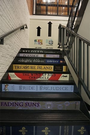
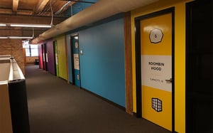

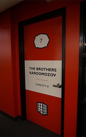
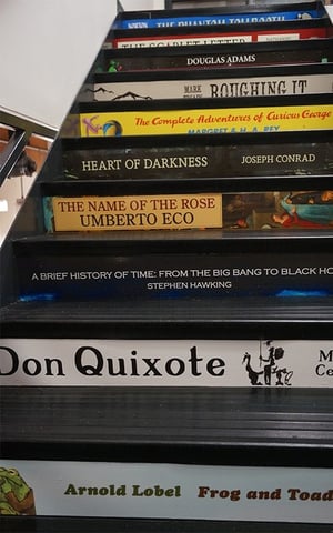
No, you shouldn’t judge a book by its cover – but maybe you can judge a space by the walls, stairs and workspace … ? As Literacenter was coming to fruition, Ratner had bold plans to incorporate visuals throughout the space. After contacting local printing companies, a partner made a recommendation (Partners By Design: a team of award-winning architects and design consultants in Chicago!)

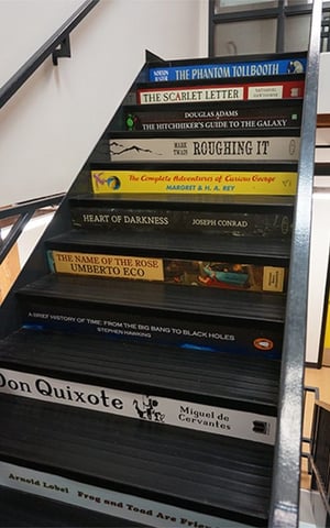
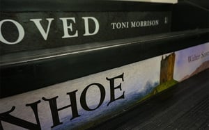
“ONE OF THE FIRST THINGS WE HAD TO FIGURE OUT WAS THE STAIRCASE, WHERE EACH STAIR IS INDIVIDUALLY DECORATED WITH A VERY PRECISE APPLICATION. WHEN I SAID 'I THINK WE HAVE OVER 40 STAIRS, AND EACH WILL BE DIFFERENT – WILL THAT BE A PROBLEM?' CUSHING SAID "NO PROBLEM AT ALL!”

Use the steps to stomp up and down a stack of books as each one has an outward facing, full color graphic. Book spines are sandwiched between the steps, with classics such as Heart of Darkness and The Canterbury Tales.
OH AND WE COULD NOT HELP IT – THE LITTLE PRINTS IS A REFERENCE TO THE LITTLE PRINCE – ALSO INSTALLED ON THE STEPS WITH VINYL.

FOR WHOM THE STAIRWELL TOLLS
YOU’LL ALSO SEE CUSTOM WAYFINDING PRINTS POINTING VISITORS UP AND DOWN THE STAIRCASE.
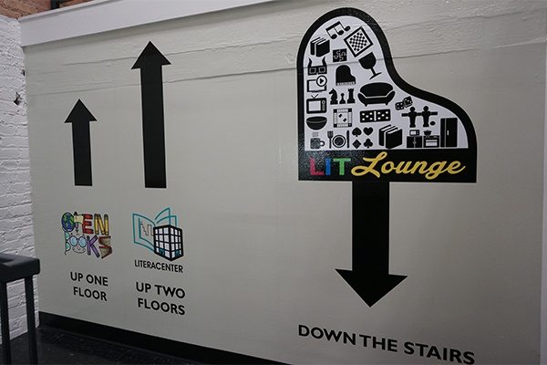
INTERESTING VISUALS DO MORE THAN JUST TELL YOU WHICH DIRECTION TO GO.
Enjoy puns? Throughout Literacenter, office and conference room doors are adorned (yes, intentional) with brilliant word play on famous book titles. Our personal favorites: The Island of Dr. MoRoom, Roomeo & Juliet and WutheRoom Heights.
ONE IN PARTICULAR PRESENTED AN INTERESTING CHALLENGE.
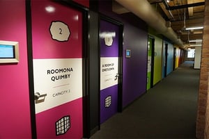
“IF YOU WALK AROUND THE LITERACENTER, YOU’LL SEE CUSHING EVERYWHERE. YOU’LL SEE THEM ON THE DOORS OF OUR CONFERENCE ROOMS, WHICH ARE ALL NAMED AFTER BOOKS (BECAUSE AFTER ALL WE’RE A LITERACY ORGANIZATION). YOU’LL SEE THEM ON THE BIG WALL WHERE OUR MISSION STATEMENT IS AND ON THE WAYFINDING SIGNAGE. AND OF COURSE YOU’LL SEE THEM ON THE SPINY STAIRCASE, WHICH IS PROBABLY MY FAVORITE FEATURE.”

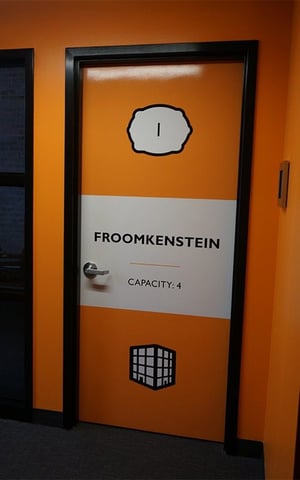

Roompelstiltskin is the very clever office name, down on the lower level of the Literacenter.
STROLL PAST STUDENTS AND FOOSBALL TABLES IN THE LITLOUNGE FOR A PEEK (YOU MIGHT SAY WE HAD TO SPIN STRAW, WELL … INK, INTO GOLD).
Without true gold ink to use, the Cushing production pros developed a custom gold gradient – the color simply did not exist before the project.

More and more, wall graphics are finding their place with the office space. Literacenter also incorporates this design trend in their space.
GRAPHICS GRAB ATTENTION WITH A PLAYFUL CITYSCAPE AND MISSION STATEMENT.
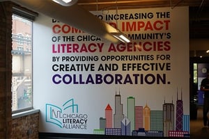
“BECAUSE WE'RE A LITERACY ORGANIZATION AND LOVE WORDS, LET US SAY: WE ARE THRILLED, DELIGHTED, ELATED, OVERJOYED, AND TICKLED PINK (PLUS 20 OTHER COLORS) WITH THE WAY CUSHING HELPED BRING OUR IDEAS TO LIFE. FROM THE WONDERFUL CUSTOM VINYL WALL GRAPHICS AND SUPERB STAIR DECALS TO THE IMMACULATE INSTALLATION AND SPLENDID SERVICE, YOU'VE HELPED MAKE OUR SPACE JUST THE WAY WE DREAMED IT WOULD BE.”


