INTERFAITH YOUTH CORE
‹ Back to Portfolio and Case Studies
Interfaith Youth Core
An office design creates opportunity to share a company mission, vision, and goals.
Designer: Perkins+Will
Print Consultant: Mike Sherkey
Project Manager: Julia Kaufman
Customer Service Heroes: John Nelson and Anjelica Garcia
Writer & Photos: Jon Davis (images also provided by Interfaith Youth Core)
Interfaith Youth Core is working to make interfaith cooperation the norm in America. This starts in colleges and universities, where the minds and values of emerging leaders are shaped, and conversations take place that steer broad cultural change. For many guests, the first interaction with the brand and company mission takes place while visiting the downtown Chicago office.
Unique stories present exciting challenges. Creating an appealing office space was important, but it also needed to communicate vision, history, and long-term goals. Amber Hacker is the Vice President of Operations and Communications at Interfaith Youth Core, and we recently discussed their project experience.
Our particular challenge, and opportunity, with this project was to use our office space to tell our story and showcase our work using design elements in our space.
Not your typical non-profit, Interfaith Youth Core saw the office branding as an opportunity to address an unusual challenge. The organization’s name starts conversations, but does not always communicate who they collaborate with, or work they complete.
Interactive graphics could fill the gap and share their story.
“We’re not a foundation or educational policy organization, and most folks have a frame of reference for these types of non-profits. For some, our organization’s name doesn’t fully explain who we are or what we do, which is a unique challenge. The office design presented another opportunity to communicate who we are and the work we do.”

Established in Chicago in 1935, Perkins+Will is an a global interdisciplinary, research-based architecture and design firm. Perkins+Will’s Interiors practice developed an office renovation plan that effectively made use of the available space & unique conditions of the Chicago Board of Trade building.
Their Branded Environments team collaborated with Interfaith Youth Core to synthesize their new identity (created by Free Range) into strategic brand communications, environmental graphics, and interactive elements within the office space.
This work helped the identity to come ‘to life”, while helping to tell IFYC’s mission, vision, & story to external visitors and partners, as well as internal staff members and stakeholders.
Through a competitive bid process, Cushing joined the IFYC – P+W collaborative project team. The entire project had custom elements, including a life size rendering of a design concept and producing multiple color samples to ensure the right shade of gray. How did this project come together?
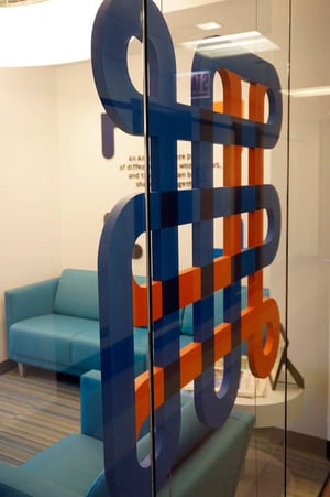
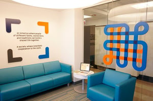
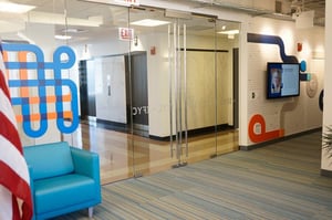
Stepping off the elevator, graphics grace the front door. Held in place by cables, a custom cut and painted acrylic logo adorns the waiting area; easy to admire from both the inside and outside the office windows.
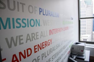
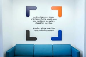
Impossible to miss, dimensional lettering showcases the organization’s mission statement.
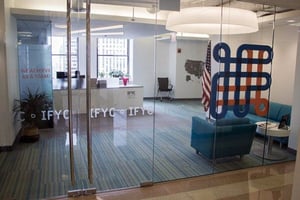
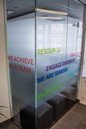
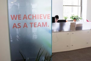


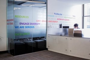
Approach the reception desk for privacy film peppered with positive messages of unity and collaboration. Frosted with a combination of colors, it creates a private conference room space that does not intimidate.
It provides privacy without closing off the space.
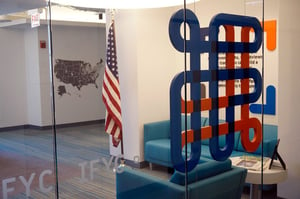
Sure to impress even the most curious cartographer, there is so much to explore on the interactive hallway map.
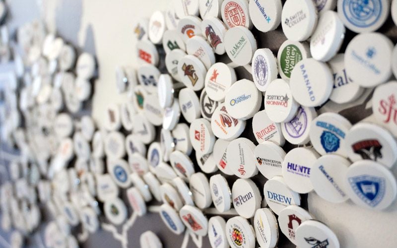
Pins spotlight the colleges and universities which Interfaith Youth Core partners with throughout the United States.
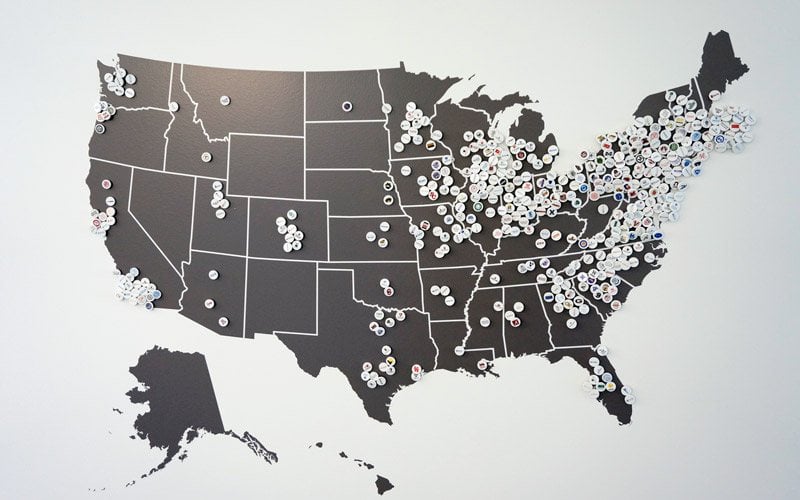
School logos, printed to stickers, are adhered to each pin.
“Cushing delivered on several fronts – they had the most competitive pricing out of all the vendors we researched, they exceeded our expectations on the final products for our office space design, and they had outstanding customer service throughout the process. I would highly recommend Cushing to any organization that’s looking for an outstanding product at a reasonable price.”

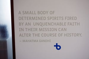
Installed throughout the office are quotes that inspire, and make one ponder. Famous names appear outside of individual offices, including leaders Malala Yousafzai and Mahatma Gandhi.
It shows privacy window film continues to trend beyond traditional opaque film.
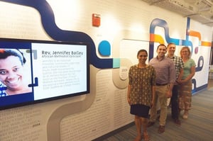
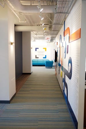
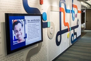
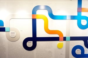
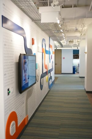
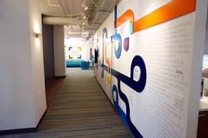
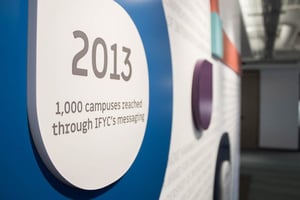
At the core of this environmental branding project is a timeline, weaving company history from inception to the move into their current address. In the center of the office, it combines vinyl cut graphics, dimensional lettering, and a flat screen television! It displays images of volunteers, including their biographies and work, on a looping powerpoint presentation.
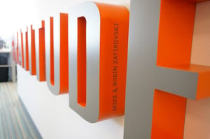
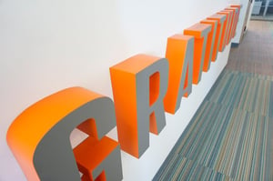
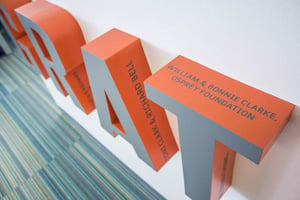
The Gratitude wall recognizes the organization’s supporters. Each letter combines two colors.
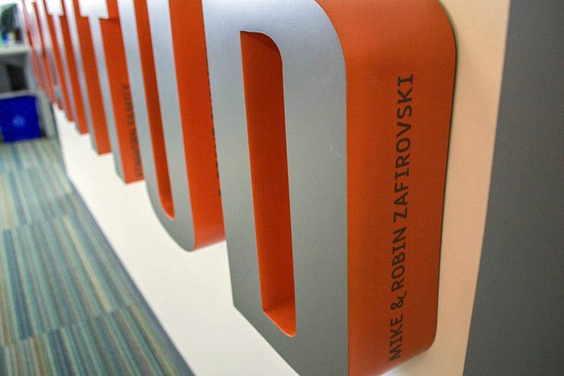
The clever design features individual names of contributors.
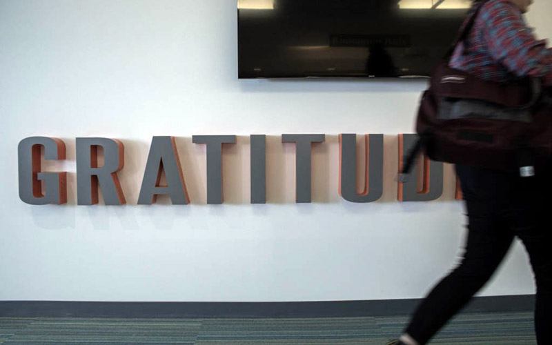
When new names or letters need to be added, it is not a complicated switch.

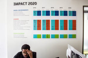
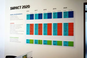
Last (but certainly not least!), keeping the team on track is an interactive graphics board. Tucked toward a back corner, it tracks the organization’s critical business plan goals with names such as “leaders” and “model environments.”
Staff members can write on the dry erase material and update goals achieved throughout the month.
Many pieces made up this office graphics puzzle. All parties followed the office building guidelines and kept Interfaith Youth Core informed to keep installation schedules moving forward. Communication prevented major bumps in the road.
