
‹ Back to Portfolio and Case Studies
Be Leaf
An un-be-leaf-able project installation.
A new restaurant concept to inspire healthy eaters everywhere!
Don't Leaf Yet!
You have to see it to be leaf it, seeing is be leafing. OK – You get the picture! Bringing fresh salads and wraps to the Chicago Loop, Be Leaf makes healthy eating easy. Becky Marks always had aspirations to open a restaurant that offers quick service without sacrificing health.
Project Goals:
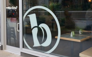
- Attract new customers with storefront window graphics
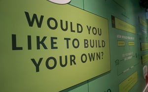
- Show customers how to build their own salad or wrap with interior graphics
- Keep hungry customers moving toward the pick-up window
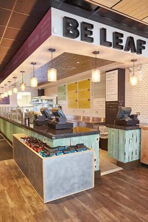
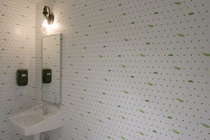
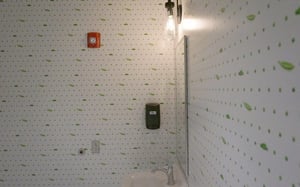
- Bright and fun décor that matches the personality of their brand. (Check out “Pea pod paper” lining the restroom walls!)
To create a welcoming space, Becky reached out to Amelia Street Studio, a creative marketing agency which has assisted businesses of all sizes.
Co-Founder and Creative Director, Katy Osborn, connected with Cushing Account Manager Josette O’Neil for advice on materials, selecting designs to be direct printed to sintra while others fit better as vinyl applied to the wall.
After conducting test prints to ensure exceptional results, a site survey with Becky and the general contractor confirmed measurements and installation expectations.
“Having worked in the Loop, I wanted Be Leaf to brighten a person’s day after walking in the door. With attention to sustainability, we can make it healthy even when people are in a rush! Our graphics and restaurant menus help to accomplish this!”

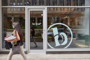
Located on Wacker Drive, there is a tremendous opportunity to attract potential new customers walking by. Between smartphones and competitor restaurants, it can be challenging to cut through the clutter.
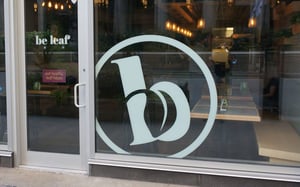
Vinyl cut window graphics on the front door and main window pique interest.
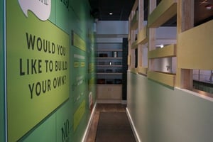
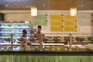
After entering the restaurant, customers queue into a hallway. For busy professionals zipping in for a quick (but very healthy bite), the wall coverings impress but also serve a purpose. Graphics colorfully communicate how to build a salad or wrap without confusion.
“WE HAVE SUCH A CUSTOMIZABLE MENU AND THERE’S LOTS OF INTERACTION. THE SIGNAGE HELPS CUSTOMERS EASILY FIND WHAT THEY WANT.”
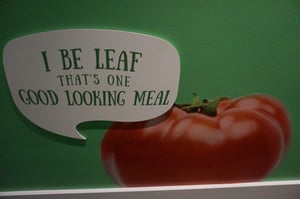
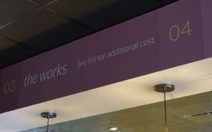
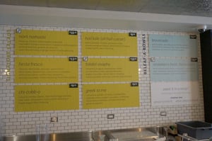
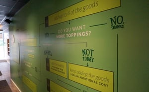
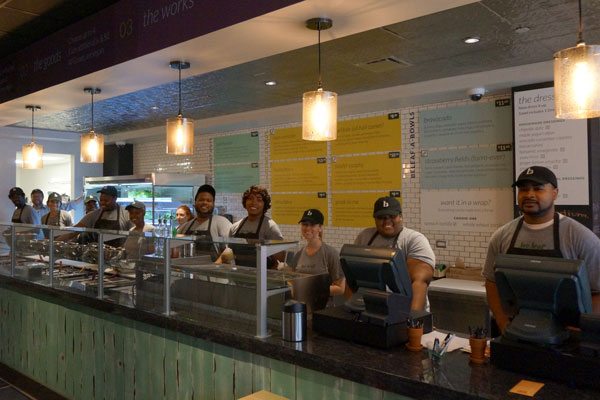
Once patrons know how to place their order, signage lists lunch options, with fun names including bravocado and strawberry fields (farro-ever) – get it? They serve as a colorful backdrop that complements the modern, inviting space and staff use it to help customers understand what they include with their meal.
The savvy look is extended into restrooms as well. Custom wall coverings tastefully display simple but attractive patterns. It’s just another way be leaf is making a statement.
The final part of the project? Menus that can be used in the restaurant and compact enough to be taken back to your office. The installation attracts new customers, complements the brand and creates a memorable dining experience.
Explore additional restaurant print marketing solutions Cushing offers.
Need a project estimate?


