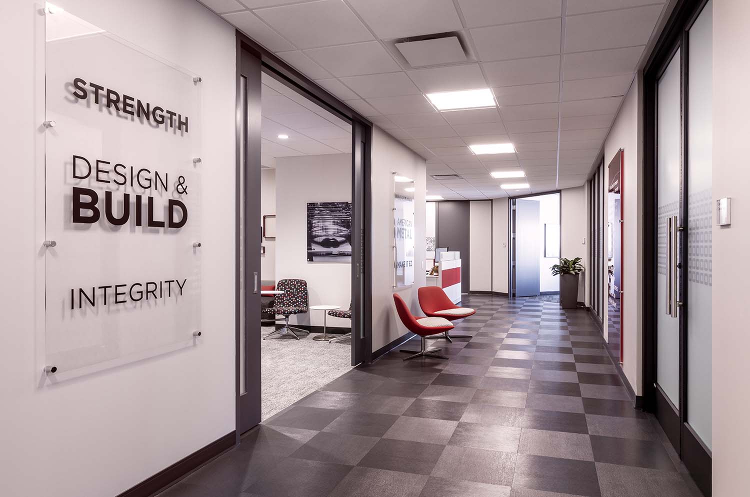
This project goal was to bring Atlas Tube’s newly renovated office to life through thoughtful environmental graphics created to enhance the interior design.
Executive Conference Room
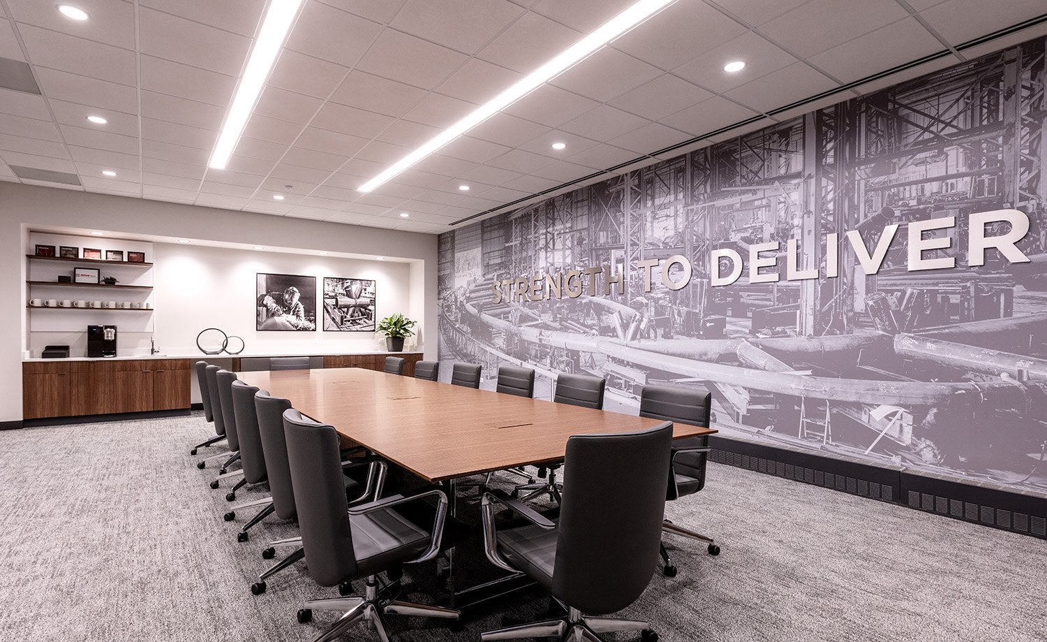
The office and production facility, located on the far south side of Chicago, was the perfect blank canvas for Atlas Tube to reinforce their mission and branding. It was important for us to make sure that the graphics were entwined in the office environment – an extension and complement of the interior design.
Using bold type treatment and abstract imagery taken from their own production facility, Sepia Studio created graphics for Atlas Tube that are expressive and balanced.
On-Site Training Room
This training is a testament to letting white space shine – the negative space between the graphic elements bring focus to each wall. Flanking the tables, there are mixed media graphics, produced on a variety of materials from vinyl to acrylic to metal – bringing the Atlas mission and vision to life.
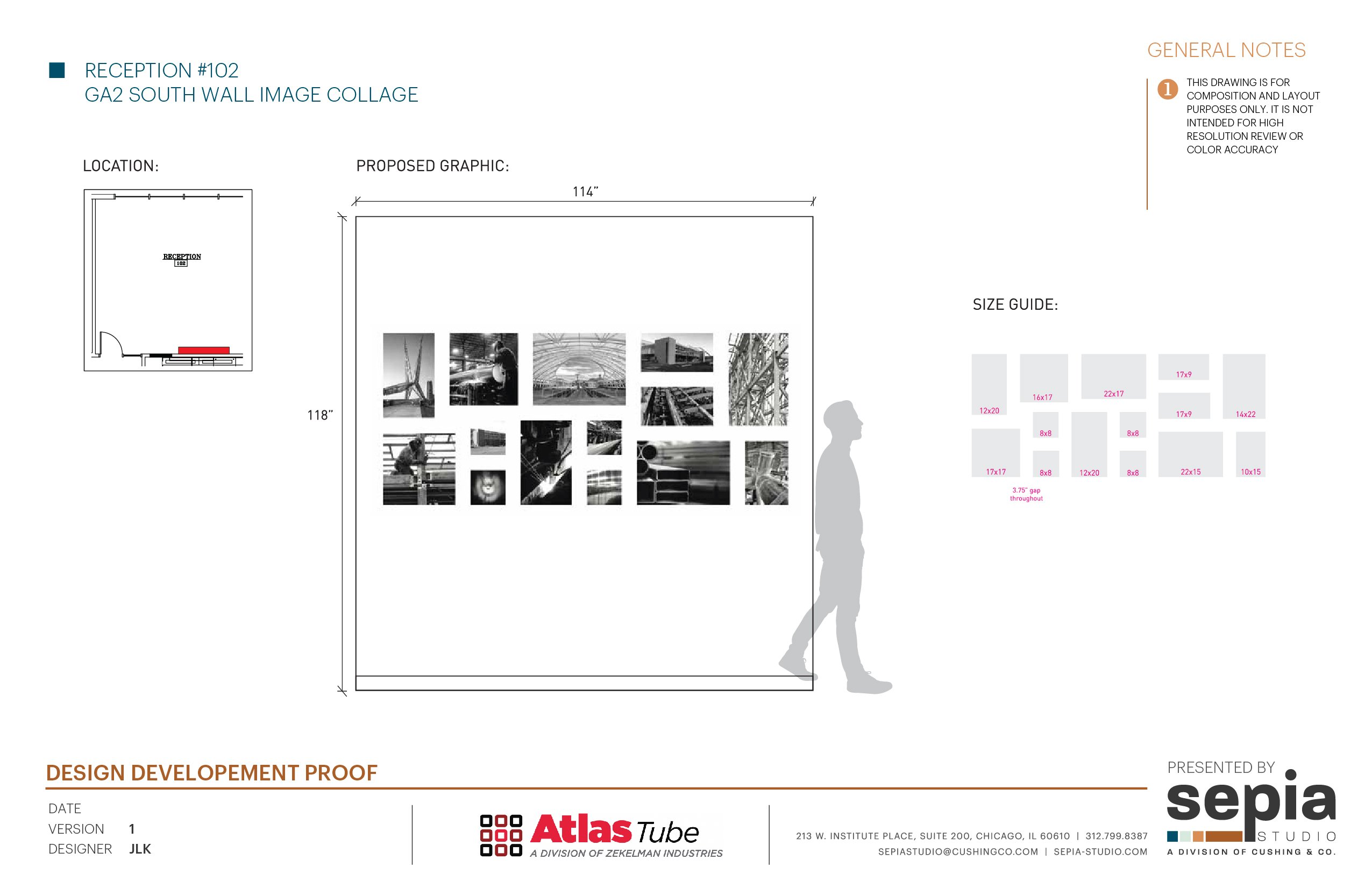
Reception Collection Rendering
In the entryway, we wanted to create a collage of images that tell the visual story of who Atlas is. Printing on brushed aluminum dibond and mounting to the wall with cleats gave us a floating showcase oozing of raw metal.
Open Office Glass Film & Wall Graphics
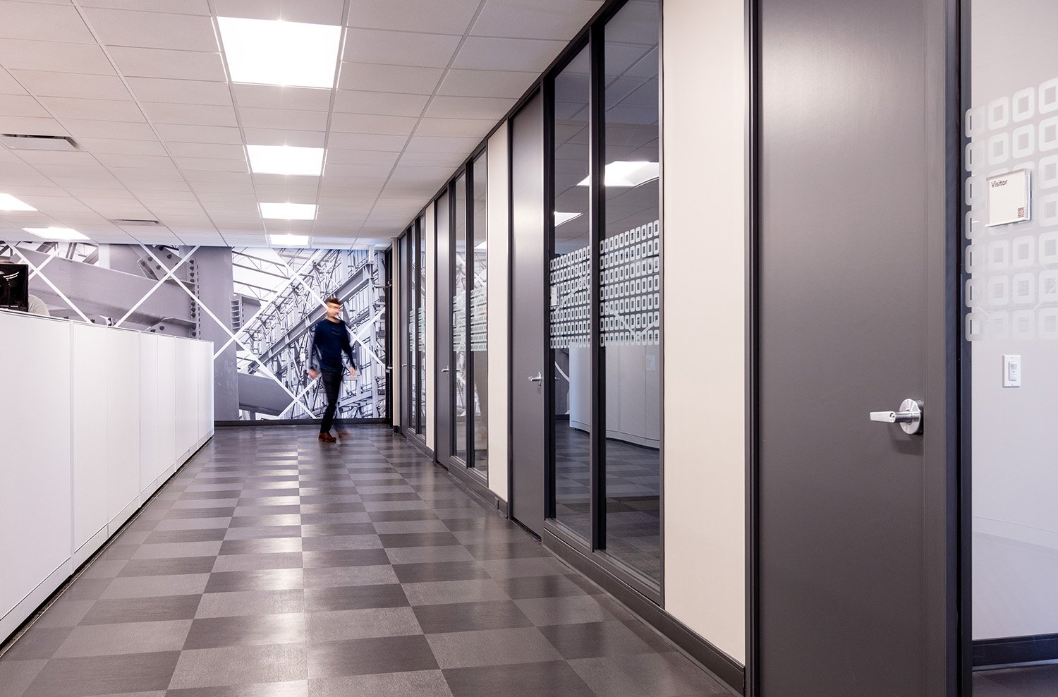
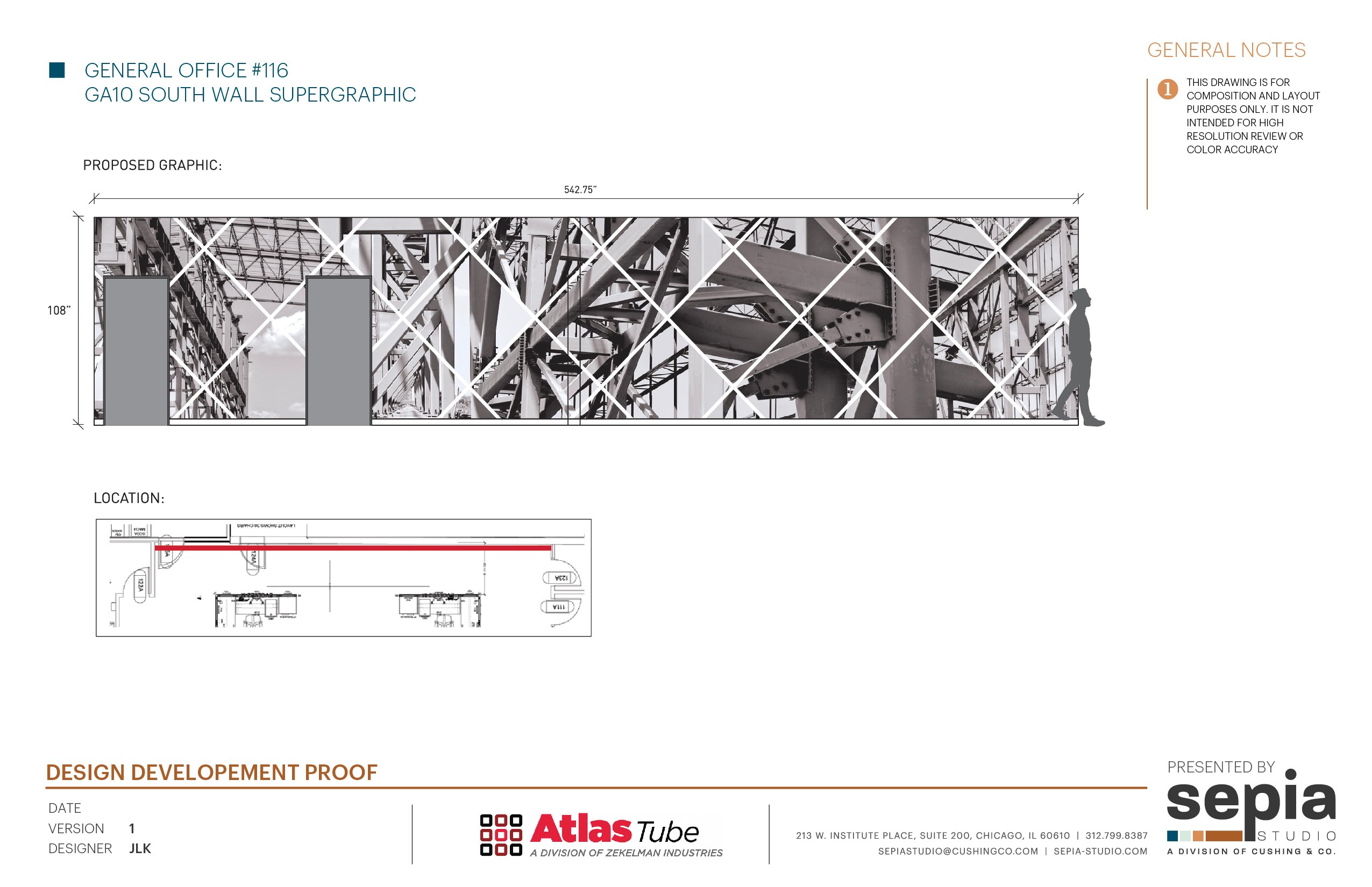
The open office area was quite the long stretch of space to fill, and the overall theme was to use Atlas project photography to show their work. We took it one step further and saw the abstract beauty in the raw beams and matrix configurations – combining and collaging portions from a handful of different projects into one supergraphic, clipping and combining where it made most sense, overlaying a thin, white geometric pattern to create visual breaks. The hallway leading up to this graphic has glass lined with a logo-inspired pattern for a small layer of privacy and a subtle layer of branding.
Kitchen and Lounge
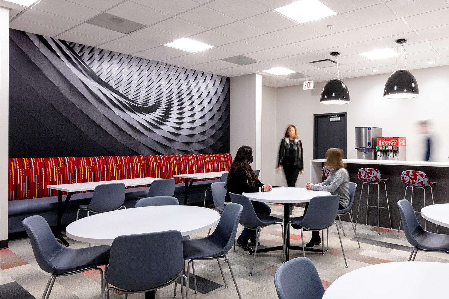
We love a drama moment, and are firm believers that eating spaces should be employee-focused, rather than company focused. In this area, we used sweeping architecture imagery to create that wow moment.
Hallway Artwork
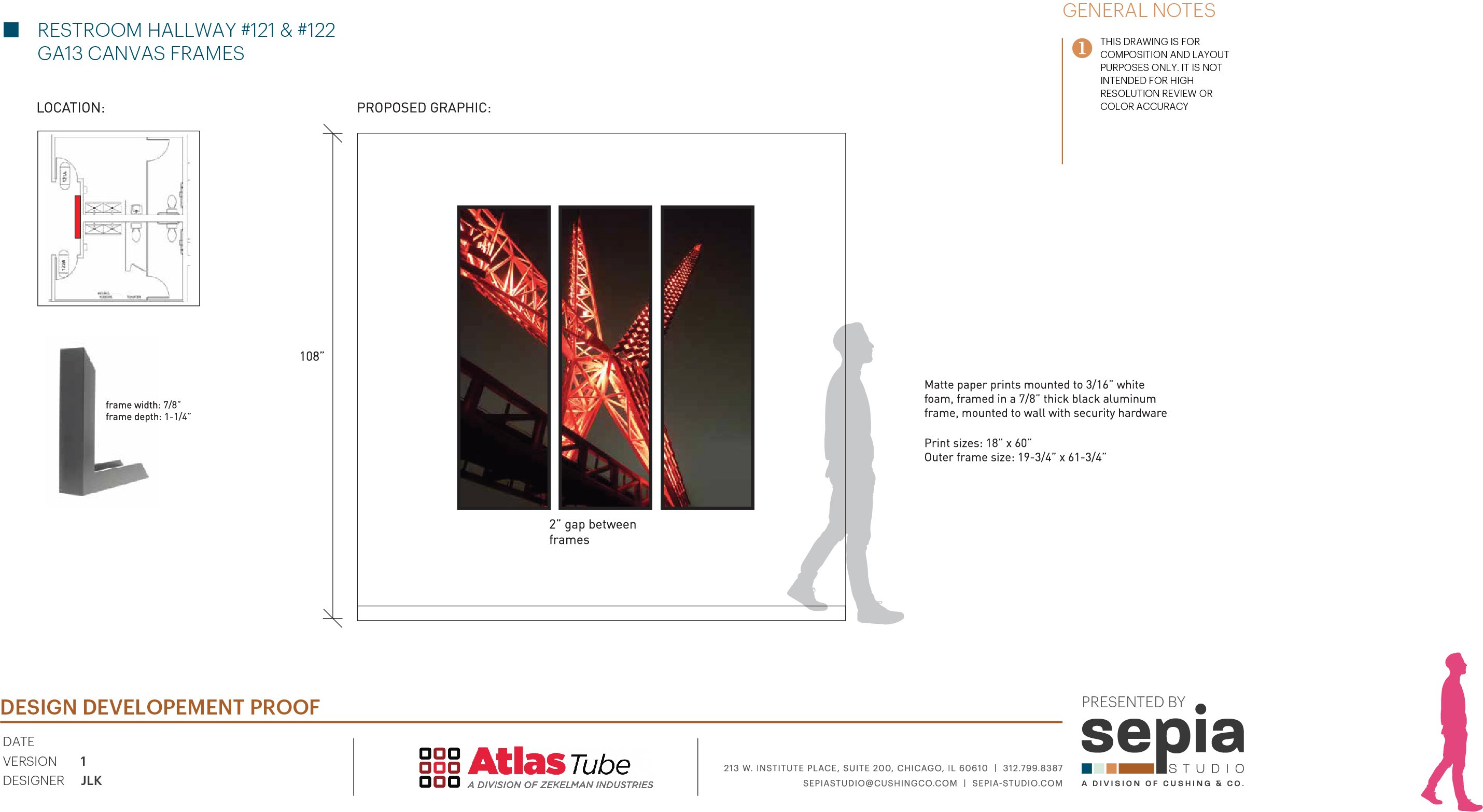
This rendering is just one of the many ways we proposed adding artwork to the space, taking one of their most dramatic tube installations and turning it into a triptych. In other areas, we produced project photos on acrylic and on metal, carrying the theme of raw materials all the way through.
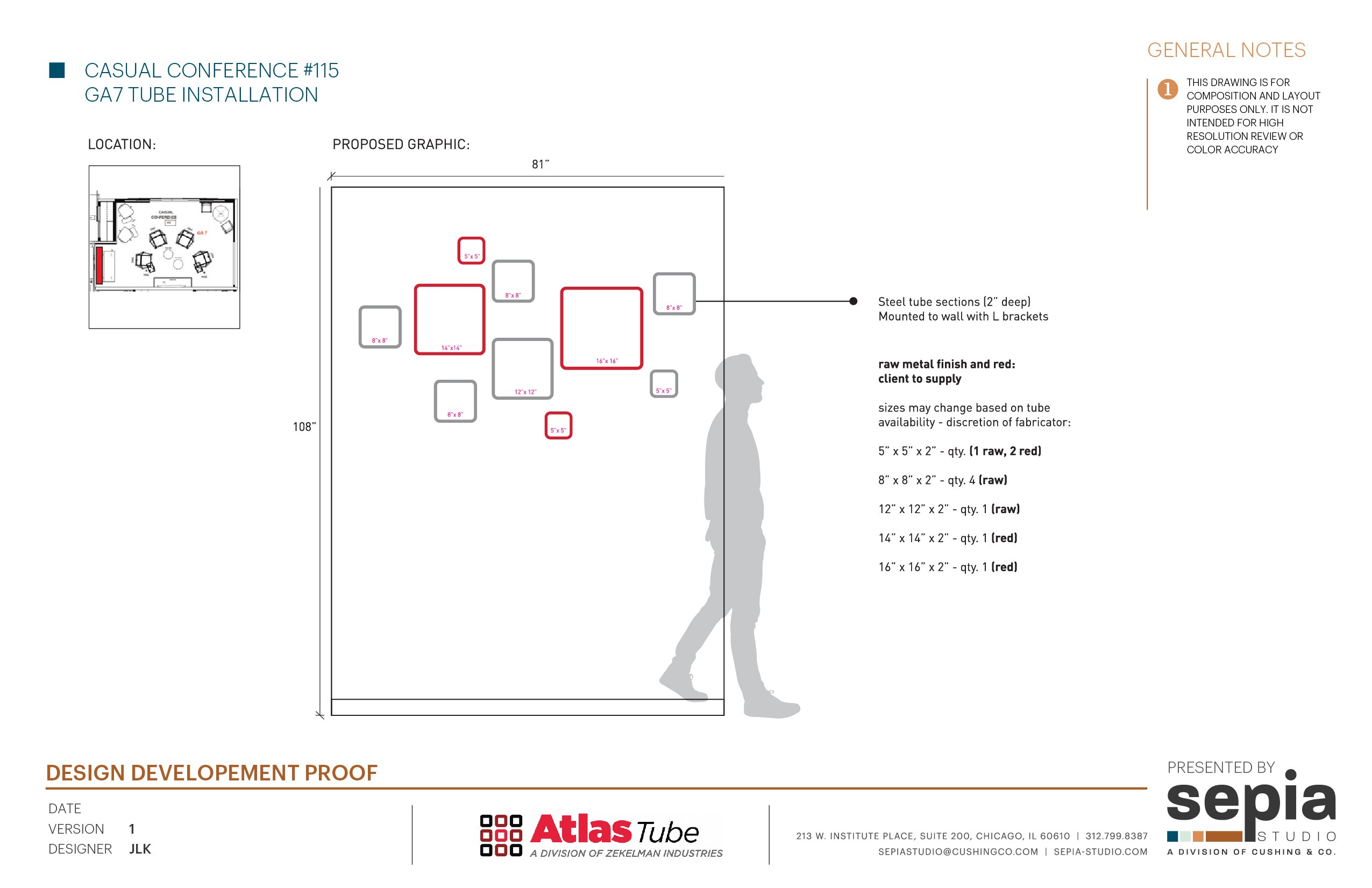
One small graphic area, but one big collaboration. We worked with Project Management Partners and Atlas Tube to turn their product into a piece of art. Slices of tubes, at different widths, and painted brand colors create this corner collage – the idea of taking Atlas’ product and changing its usage was a crucial element to this whole project.
In the rendering below, you can see how this idea went from paper to drywall.
Core Hallway
