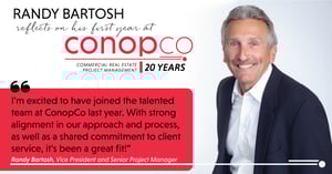
ConopCo Project Management was founded by William G. Conopeotis in 1999 to provide Project Management Services to the commercial real estate industry as an independent firm that represents the best of class in the marketplace. ConopCo’s philosophy is to be the very best at one service model, and as an industry leader in the Chicago real estate community, ConopCo has transformed the delivery of commercial space with our innovative and unique Integrated Project Management Approach.
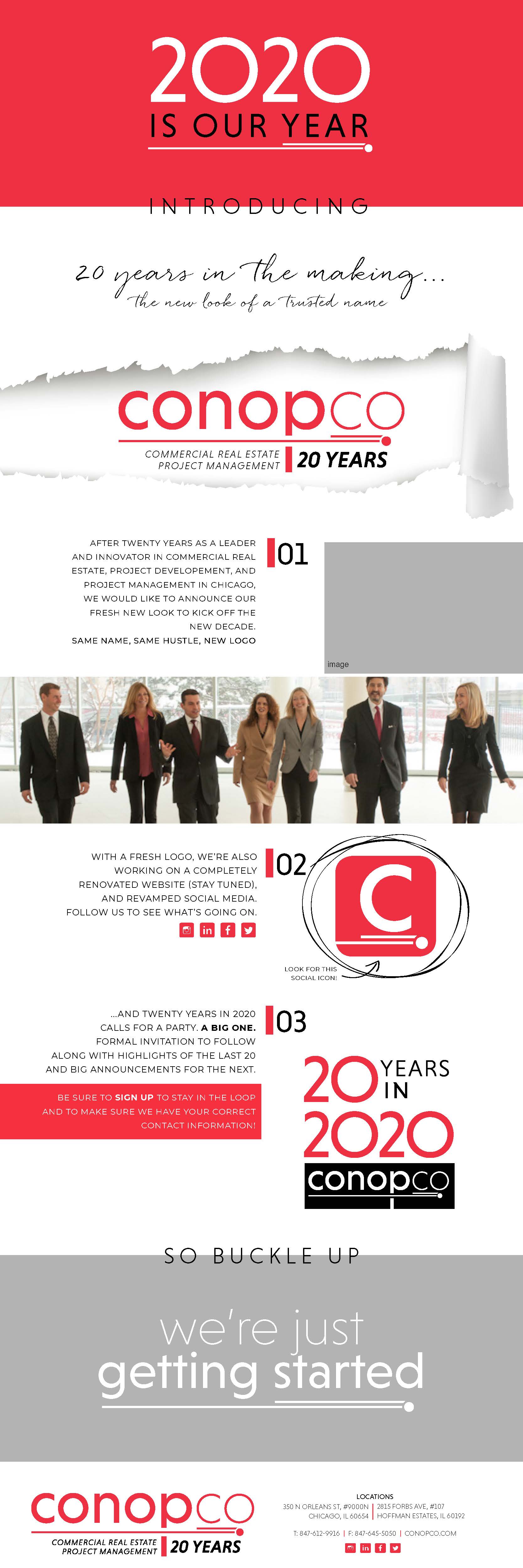
The ConopCo logo was in need of a new and fresh look. The current branding was rooted in a black, white, and red palette and we decided to start there, but upgrade.
![]()
![]() 2020 logo refresh reveal
2020 logo refresh reveal
When we sat down with Billy C. to get to know him and the brand he’s built over the last 20 years, he pulled out a picture of David and Goliath. He used that as a visual representation of how he sees the lean nature of his business. ConopCo is up against Goliaths in the Chicago Project Management market, but he’s the David that comes out on top.

We designed the round “bullet” and travel lines cutting through the “p” to represent David’s stone, impossible to stop.

where the logo goes, social media follows
We updated the social media logo to be a very simple “c” and the “bullet” underneath. We also created the instagram story highlights in a matching icon style.
a new logo launch deserves a newsletter revamp that makes a splash
If you can’t use your new logo to draw some attention to yourself, why do it?
Rebranding is a big deal.
Celebrate it. Lean in.