‹ Back to Portfolio and Case Studies
Cushing Rebrand
Written by Amanda Eich
“The cobbler’s children have no shoes”.
It’s an idiom to describe that what you do for others, professionally, tends to be the last thing you do for yourself. Cushing is ready for new shoes… er, a brand refresh.
Designing the Details
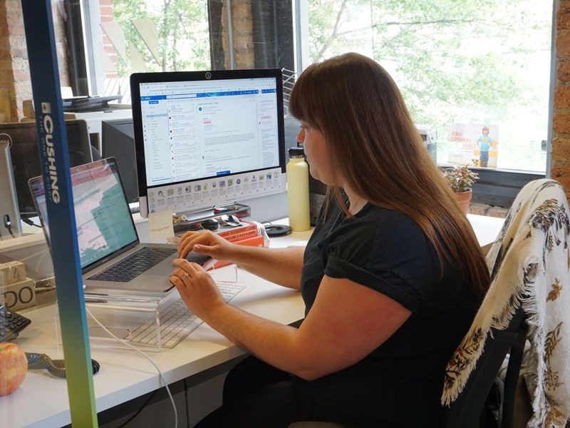
When Julia Kaufman and I dove into designing the details of the design division we wanted to create, it was a month’s long process of thinking of a name, googling domains, crossing names off, starting over, spit balling, and probably hurting some feelings. It was literally hours of conversation with Joe, a business owner and deeply invested family business patriarch; Jon, a marketing and SEO guru from the East coast; Catie (with a C), HR and marketing manager that literally keeps the office running from day to day, and two coffee addicted creatives- a graphic designer and a former architect, during the deepest doldrums of COVID.
It was like a joke – “a boss, a coupla’ marketing peeps, a designer, and an architect walk into a bar…”
But it was fun. It was fresh. It was new. It was exciting.
We landed on Sepia Studio, a division of Cushing and Co. We hit the ground running, and now almost two years in designing wall graphics, marketing pieces, the walls of entire offices for others (and pretty damn well, if I do say so), telling the story of other companies’ brand and what makes them special, we decided it’s time to take a breath and tell Cushing’s story.
It’s time for the Cobbler’s children to get those shoes.
Always Ask Julia
I asked Julia (an 8-year veteran and also the source of, “AAJ”, Always Ask Julia)– can you tell me what the hexagons are for, they’re everywhere in our branding? What font do we use? What’s the origin of the colors we use? What’s the green dot in the center of our logo- it looks like an “on” button? You had to ask the right person on the right day with the wind blowing from the west to connect the dots with the answers.
The Hummingbird
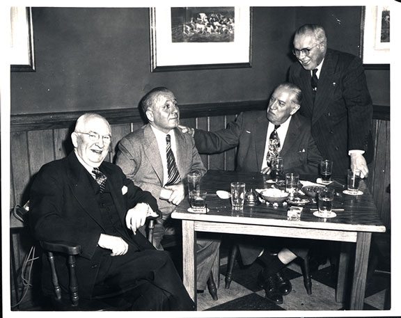
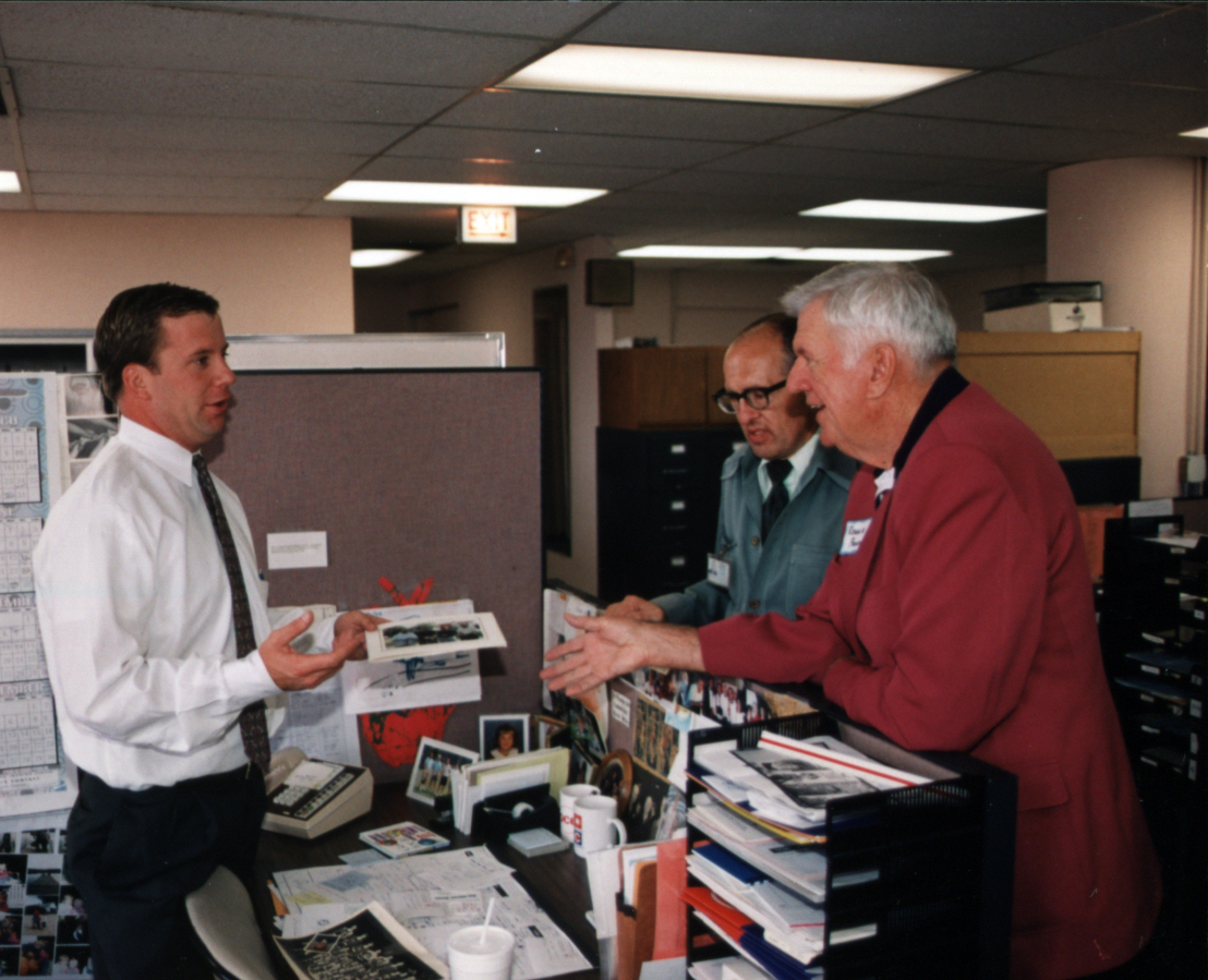
But to be fair, the answers are buried in 90 years of business servicing the Architecture and Engineering community– first as the biggest blueprinter in town, and now in 2022, we do a lot more. I like to call Joe Cushing “The Hummingbird”, the man doesn’t sit still, neither do his thoughts or his ambitions. It’s admirable. But from a marketing perspective, you need to pause from time to time and get your brand house in order before it flies away on you. We’ve been able to get away with it for so long because after almost 100 years, people in the AEC world in Chicago know Cushing. But in the last few years, Cushing has unofficially-officially started 5 new branches of its company. And most of the AEC world still has lingering, almost nostalgic, thoughts of Cushing as the blueprint guys.
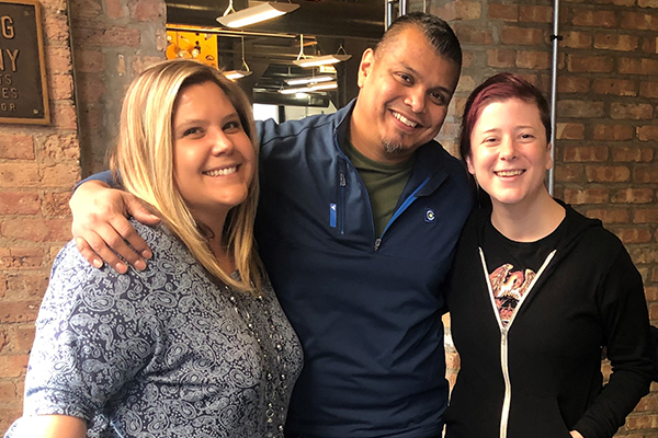
So, therein lies our challenge
Time to show the world our new shoes.
This is where Sepia Studio gets to show its chops. And also, no pressure, redesigning the logo and defining the brand of the company you just started working for, but also bears the NAME of your boss. But Joe made it clear from the beginning- this isn’t about me. It’s about the company; especially the next generation! … So that’s where we started.
Managing All Expectations
Cushing prides itself in the MAeX process that we’ve coined. It stands for Managing All Expectations.
It’s our approach to everything from a customer service standpoint. But also in the multi-step process, it lays out how projects move through the office, through each department, and at the end, every expectation for our clients have been met. Everything we do has a process, as Julia says, “it’s a relay race, and the handoff is key.”
Department Interviews
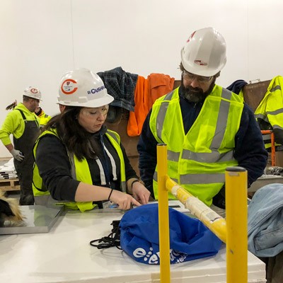
So we separated out each department, got them on a zoom (groan, but these are the times) and asked each group several key questions. The gist of each round of questions… how do YOU see the company? How do YOU describe what you do to a stranger at a dinner party? And lastly, what would you say are our strengths?
The answers from sales, customer service, graphic project managers, IT, marketing, to finishing, were similar despite each group’s very different scope of work.
We solve problems. We are nimble. We don’t say no. We work together, we communicate.
Julia and I took this back to the drawing board (literally, a board we draw on) and scribbled up what everyone said.
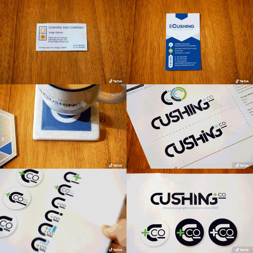
We narrowed it down and decided early on, we don’t want to focus on the tangibles. Ink drops? Nope. Pixels? Oh hell no.
Greater than the sum of our parts
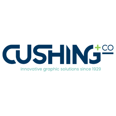
We sketched up the obvious ideas to get it out of our heads. We wanted to focus on the hard things that we all described- the intangibles. Leaning on the process-driven thought process that we all plug into every day here at Cushing in order to deliver an amazing product, we started to see the concept unfold: pieces leaning on each other, building from each other, the word CUSHING… each letter representing this process.
We are greater than the sum of our parts. Together we all are Cushing. *cue the training montage music.
The Logo
Then it clicked.
Each letter needed to be incomplete. We tucked, we pulled, we stretched, we erased, and finally, with the last edit of the “I” dagger, we were done. We snipped it’s top off and in doing so, we created a cutting edge (see what we did there?).
We are greater than the sum of our parts.
Our Parts
And with that. Can we tell you about those parts? We ARE your friendly neighborhood blueprinter, BUT
We are also a design division.
We are a 3D scanning service provider.
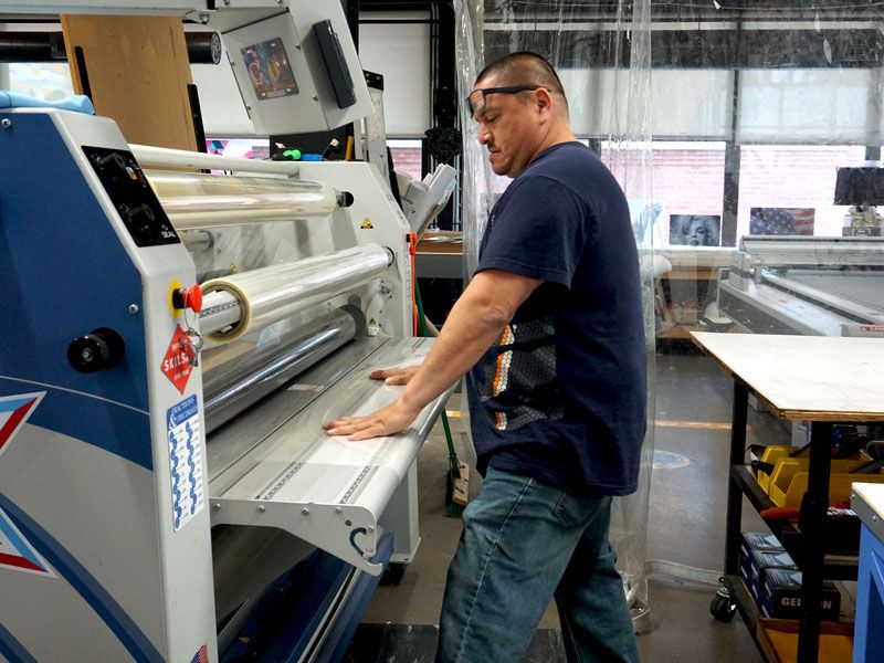
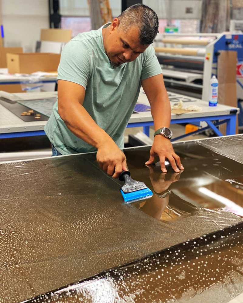
We are an environmental graphics printer.
We are a small format printing provider.
We are a CloseOut Doc provider.
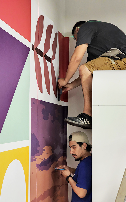
We are graphic installers.
On a Mission
Along with a logo refresh, it was time to tweak our mission statement. While our core values remain the same, our revised vision statement emphasizes that Cushing is a one stop shop for customers, and so as a whole, greater than a sum of its parts.


.png)


