
DESIGN MUSEUM OF CHICAGO
‹ Back to Portfolio and Case Studies
Design Museum of Chicago
Window graphics to a public art installation, the Design Museum of Chicago has counted on Cushing for numerous projects.
Account Manager: Josette O’Neil
Project Manager: Julia Kaufman
Customer Service Heroes: Anjelica Garcia-Sanchez, Michelle Ward, Amanda Snyder
Writer and Photos: Jon Davis (with photos from Design Museum of Chicago)
Portfolio Details
Client: Design Museum of Chicago
About the Design Museum of Chicago
Their team aims to inspire, educate, and innovate through design.
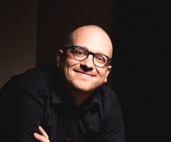
Meet Tanner Woodford
Tanner Woodford founded the Design Museum in 2012. From designer and executive director, to occasionally tending bar – sadly, we don’t have photos for this spotlight. To say he wears many hats is an understatement. Why has Cushing been his “go-to” graphics resource?
“CUSHING IS COMPETITIVELY PRICED, PRODUCES EXCELLENT WORK ACROSS MANY APPLICATIONS, AND TURNS JOBS AROUND VERY QUICKLY.”
Scroll down to find out about more work completed with Tanner’s team in 2018.
“Cushing is competitively priced, produces excellent work across many applications, and turns jobs around very quickly. Josette was responsive, helpful, and proactively worked with us to accomplish our goals within our budget.”

Can’t Contain the Excitement
Where do we start on the project list?
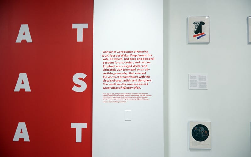
Photo: The Office of Experience
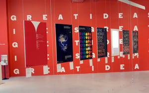
From 1950–1975, Chicago-based Container Corporation of America ran a campaign heralded as one of the best in advertising history, Great Ideas of Western Man. The world has changed since 1975, but great ideas are timeless. The Design Museum’s response to this classic campaign?
Great Ideas of Humanity.
Great Minds Think Alike
In the original series, a committee meets, creates a list of “great ideas” from a variety of thinkers, and commissions an artist or designer to create a visual response to the quote. The Design Museum used the same strategy.
How did these ideas culminate as a final project?
Duck Duck Goose
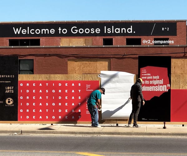
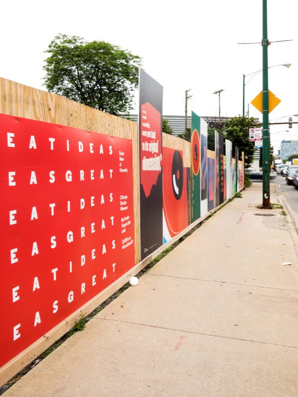
Alongside commercial real estate firm R2 Companies, the Design Museum of Chicago produced roughly two dozen large format images on a variety of substrates. The final location of the installation? A busy Goose Island intersection.
Installation Makes an Impact
Cushing and the Design Museum learned a lot about the specific environment during installation. It went through several revisions to the quantity, materials and install methods. It culminated in a meaningful piece of public artwork that is still resonating across Chicago.
Series of Substrates
From direct-print-to-plywood (and coroplast), the project used a mix of materials. Community members continue to discover it and the Design Museum has received many positive comments.
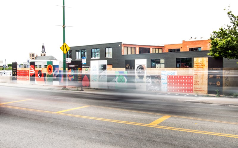
ACCORDING TO WOODFORD, “IT HAS SUBSTANTIALLY INCREASED OUR VISIBILITY.”
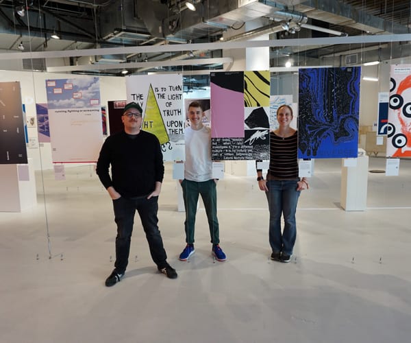
Great Ideas of Humanity Exhibition: Out of the Container
Heading indoors for the second installation, local artists and creative professional interpretations of Great Ideas were on display throughout the museum. Members of the museum team were kind enough to pose for a photo!
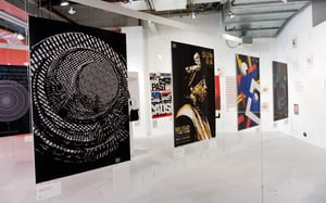
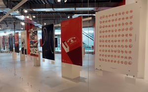
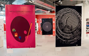
Passionate Posters
24” x 36” posters were printed to Strathmore stock.
The final display included works from previous decades and local artists currently putting their unique stamp on Chicago.
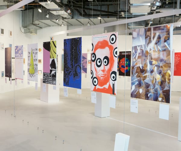
POSTERS ON DISPLAY AT DESIGN MUSEUM OF CHICAGO
A Panel Presentation
During the Great Ideas Exhibition, The Design Museum and Cushing co-hosted an event on art, impact on public space and trends in commercial environments.
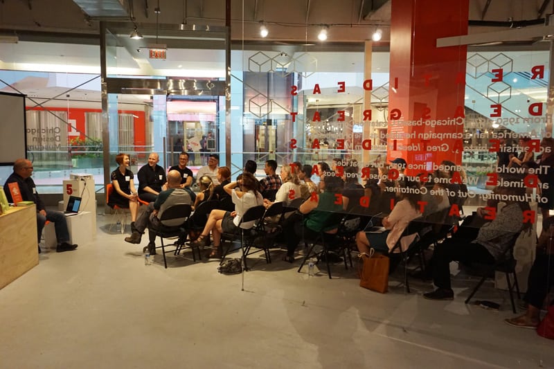
Creative professionals, artists and designers joined the conversation. Explore what happening at the Design Museum this year.
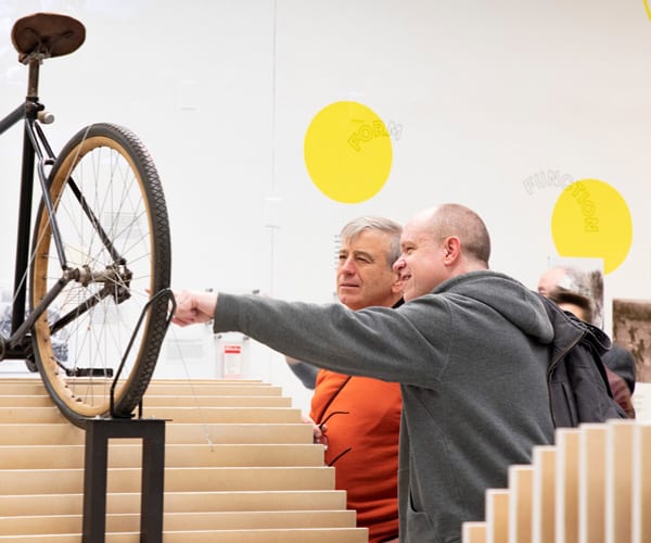
Tour de Design Museum – Expo 72 at 72 E. Randolph
ELEMENTS OF THE LAST PROJECT IN THIS ARTICLE?
Large-scale cut vinyl graphics, exterior window installation, and printed reproductions on vinyl and foam core.
Major in Cycl-ology
Annie Leue joined the Design Museum team in May 2018. Tanner referred the art director to Josette O’Neil to discuss display graphics for their current exhibition: Keep Moving: Designing Chicago’s Bicycle Culture.
“I KNEW WE HAD AN ESTABLISHED RELATIONSHIP AND THE WORK IS HIGH-QUALITY,” SHE SAYS.
The installation coincided with a move to their new space.

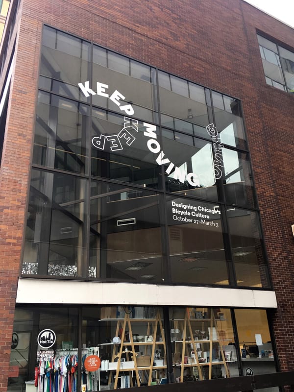
Fork in the Road
Certain approaches to signage installation had to be reconsidered. Plans changed, including a redesign from banners to vinyl. While scaled back, the project found the right path.
The Cushing team communicated directly with the building manager and city officials on an alternative solution that addressed needs, while managing cost.
Switching from printed mesh banners to cut vinyl, presented an alternative. Vinyl cut lettering is a mix of matte black, first surface and matte white, first surface.
“Josette worked with us every step of the way, speaking directly with the building manager and other city officials to find the most appropriate method of installation that addressed the budget. Overall, it was a great experience.”

Spin Zone
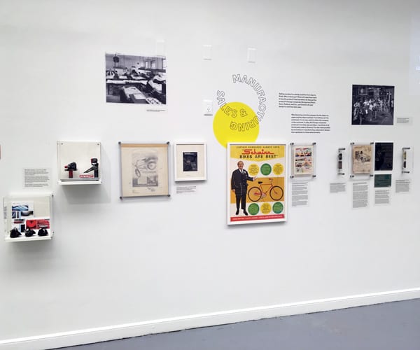
Prints come together in a flurry of 3/16 “ (inch) foam core.
Classic advertising and lettering are imaged to Print to Avery MPI removable vinyl. They attract the eye and enhance the exhibition.
“We had the best experience with Josette. She was responsive, helpful, and proactively worked with us to accomplish our goals (and reach our deadline) within our budget.”


